HP Brand Transformation
I worked on HP before the split, building a brand to bring together 320,000 people into a collective whole.
Despite ranking #1 or #2 in nearly every category they competed in, customers saw them as the commodity printer company—not the innovation powerhouse they actually were. After 56 acquisitions in five years with no central marketing leadership, individual business units were literally running different versions of the HP logo. Brand chaos was eroding billions in potential value.
In Fall 2008, I was hired as the Global Creative Director to deliver a comprehensive rethink of the brand strategy, identity and expressions for all 56 business units in 176 countries under one coherent system.
The transformation delivered immediate results: $3 billion in brand value added within 18 months, measured by both Interbrand and Millward Brown. But the deeper victory was coherence—for the first time, HP felt like one company making everything work together, from enterprise servers to consumer printers to digital experiences.
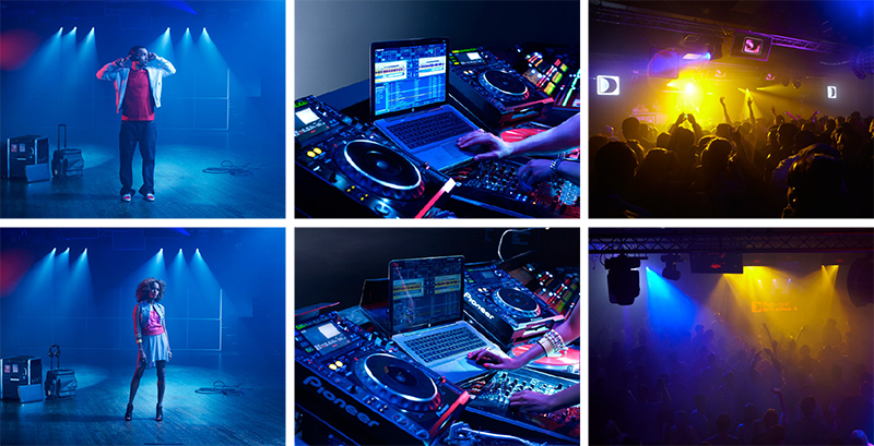
Let’s Do Amazing: HP + Dr Dre. Did you know that HP cocreated Beats By Dre? Even I didn’t when I first walked in the door. Talk about a story worth telling.
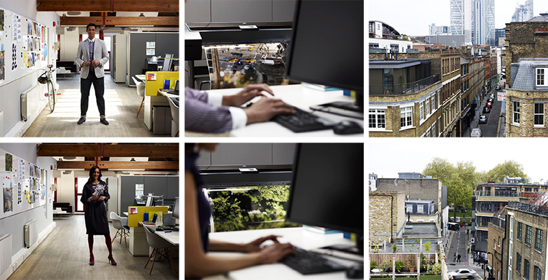
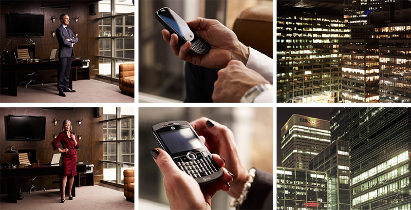
Let’s Do Amazing: HP + UPS. We had to account for the enterprise innovation work as well as the consumer work, and we loved this story of what we’d built with UPS.
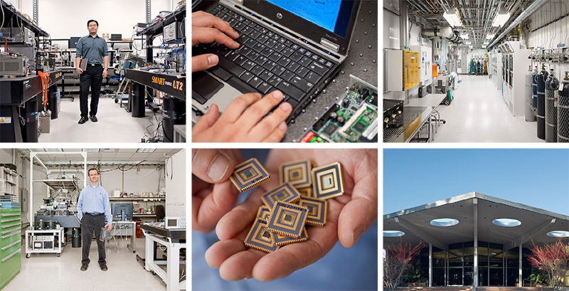
Let’s Do Amazing: HP Labs. We’d be remiss to have any conversation about the innovations from HP without shining a light on some of the innovations coming out of our very own HP Labs. Thanks, Sridhar Solur, for being a star ;)

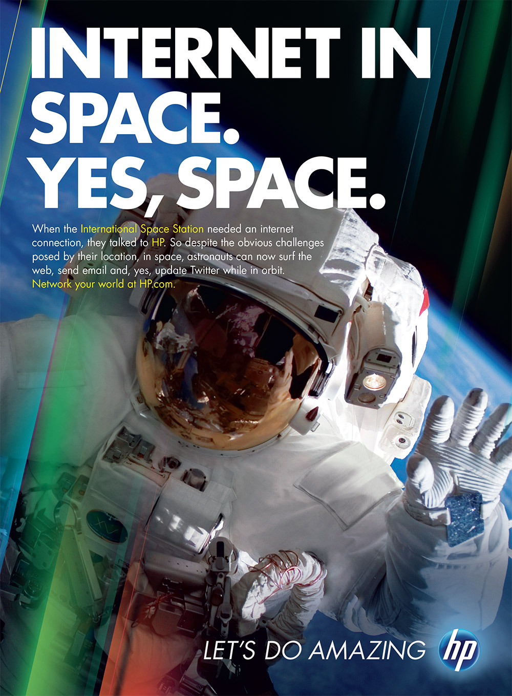
Let’s Do Amazing print ad featuring the HP Envy Beats Edition, and another focused on our work networking the International Space Station. No, really: HP was the only company to network air, land, sea and space. Did you know?
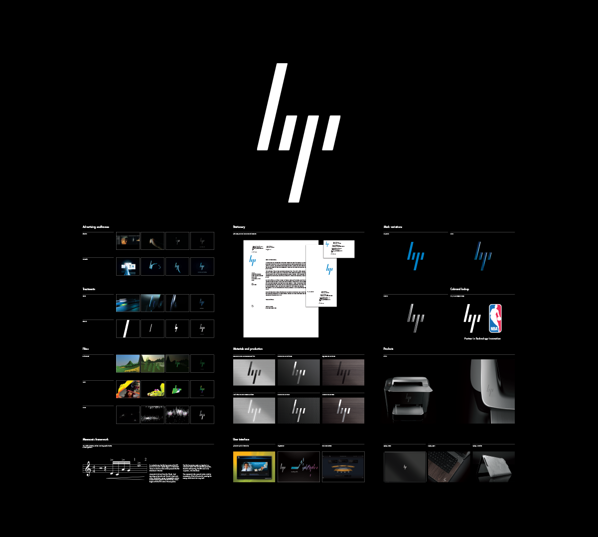
The heart of the new brand was the Progress Mark, built to adapt to context and the stories being told. Building an iconic mark with the ability to shift form, shape and substance allowed us to not just be adjacent to the story, but to be integral to the very story being told.
The Progress Mark’s reveal film. The film encapsulated the core strategy, but then went further to show the number of ways the brand to spring to life, in print and in pixels.
When the Global Identity & Design System was completed, we built "True North" as an inspiration film to be used by all of our designers, agencies and partners. This brings the principles to life by itself, but showcases the broad range of expressions for a truly dynamic brand.
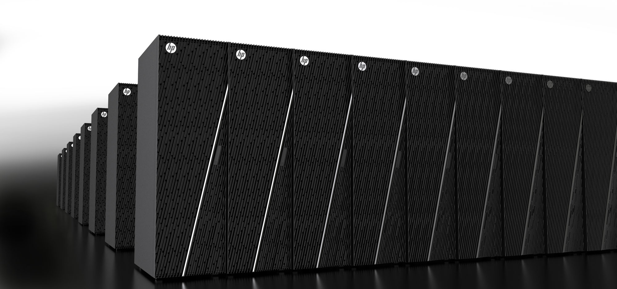
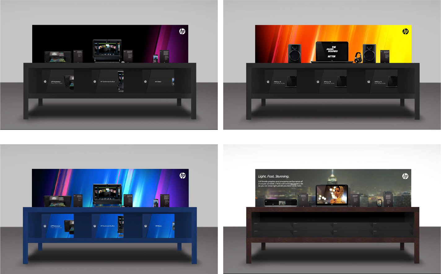
The design system intended to reinforce HP’s leadership position in color: vibrant, confident and expressive. Built around a bespoke series of gradients set at a 13° angle to match the Progress Mark, the entire system was thoughtfully crafted out of light.
Everything we built needed to flex from consumers, to C-Suite, and everyone in between without feeling disconnected or fragmented. Ironically, our consumer-focused creative became the dominant driver of engagement at our Executive Briefing Centers, showing the power to pull the C-Suite through consumer-facing experiences.
One of the last pieces we created before Mark Hurd’s departure was a celebratory film for the entire culture of HP, from the early beginnings and all of the unexpected innovations to the current mindset of the people across the business. In their voices, their words and their commitment to the future of the entire business came to life in a way that we can all feel.
The hero film for Léo Apotheker’s “coming out party” in January 2011, showcasing all of the ways that HP could find itself wildly differentiated by leveraging WebOS across the full portfolio. Built with the help of Native out of London, every one of these product concepts was invented in a three week pre-production window.
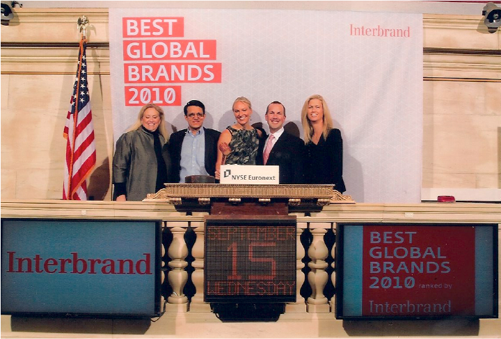
Ringing the bell at the NYSE, as part of Interbrand’s celebration for the Top 10 Best Global Brands. It was the only year that HP ever got into the Top 10, with an increase of just over $3B in brand value in our first year of the program.
